Google is increasing the usage of blur and translucency throughout the whole operating system, according to recent leaks from internal builds of Android 17 (codenamed “Cinnamon Bun”). The glassy embrace of Android 17 is a change which is a component of the developing Material 3 Expressive design language, which eschews solid backgrounds in favour of a “frosted glass” look.
It’s a blurred aesthetic instead of its current flat design style, in which Google intends to implement a frosted-glass style for key user interface components, such as the power menu and volume slider. The dynamic colour is expected to colourise blurred surfaces, ensuring transparency effects align with your wallpaper and overall theme.
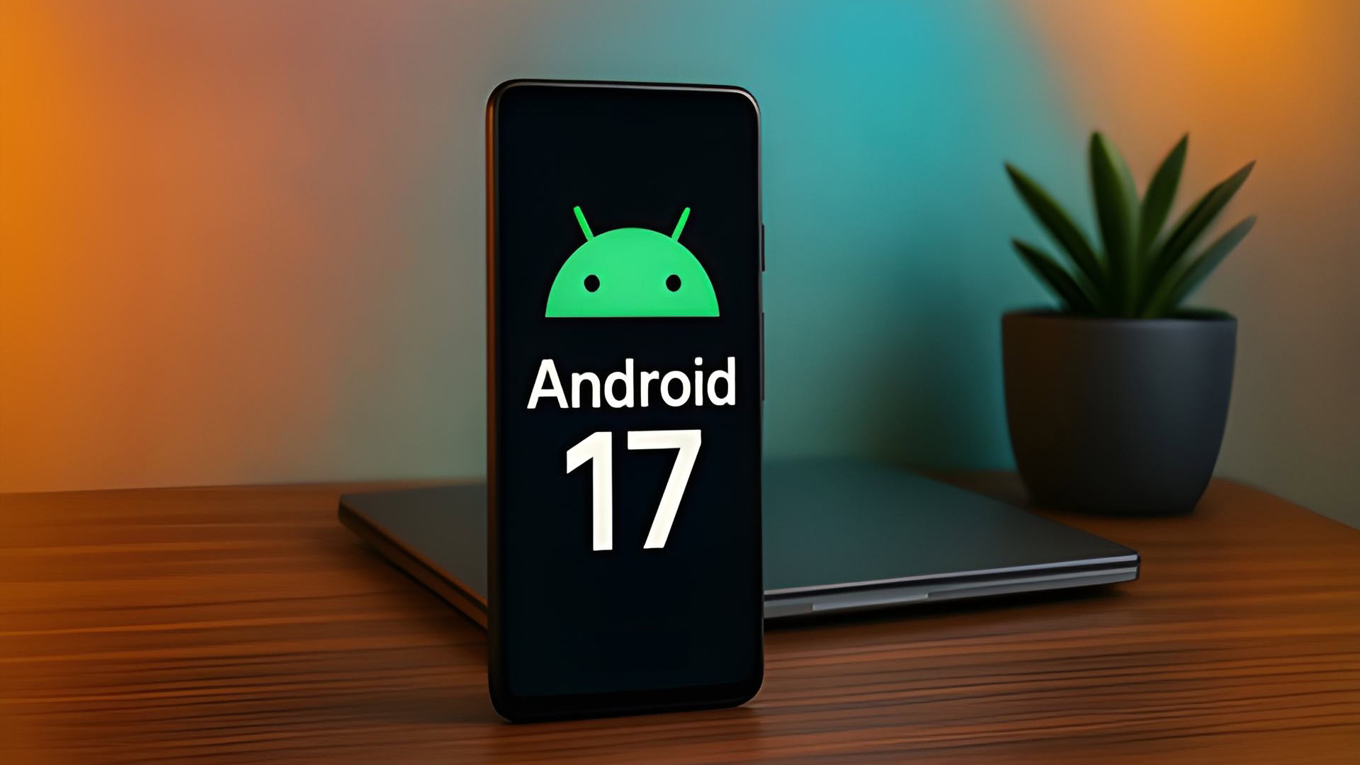
Even though Android 17’s official release is still months away, it’s obvious that Google intends to alter how you use your phone. The upcoming iteration, code-named “Cinnamon Bun”, is reportedly focused on translucent, hazy backdrops after years of flat, solid colours.
With the release of Material 3 Expressive last year, which introduced slight blurs to the Quick Settings panel and notification shade, we witnessed the beginning of this transformation. In order to make the user interface feel lighter rather than like a thick, impenetrable wall of colour obstructing your view, Google sought to generate a sense of depth.
Users can maintain awareness of the app if they are just using it while concentrating on the task at hand by blurring the background rather than completely burying it. It establishes a hierarchy that appears more natural to the human eye, and Android 17 is expected to advance this idea.
Google appears to be fully embracing the frosted-glass appearance throughout the system in the upcoming edition. This translucent effect may be visible in some important UI components in internal builds that 9to5Google has viewed. One significant modification is the volume bar, which now has a translucent slider that allows your program icons or wallpaper to be visible.
This method also works for other system overlays, such as the power menu. According to reports, your Dynamic Colour theme tints the blurring, making the entire OS feel cohesive.
Although some may argue that this style is similar to Samsung’s latest UI changes or Apple’s Liquid Glass design on iOS, Google’s execution is supposedly more understated and sophisticated.
When the first Android 17 Developer Preview, which is anticipated in early 2026, arrives, we’ll probably notice these changes the most. It’s anticipated that the blur effect would primarily show up in system menus, although it’s unclear if Google will apply the new Material Design rules to third-party apps.
To guide users to control the blur effects, Android lets you turn off the new blur effects if its users find them annoying or think they are affecting performance.
Launch the Settings application.
Go to Colour & Motion under Accessibility.
To go back to solid backgrounds, toggle on Reduce blur effects (also known as “Remove blur”).
It is anticipated to be released, with a major release expected in June 2026. Android 17 is expected to adhere to Google’s revised release cycle. The first hands-on experience with these modifications is anticipated in early 2026 through canary builds or early developer previews.
We use cookies to ensure that we give you the best experience on our website. If you continue to use this site we will assume that you are happy with it.


