Just recently Google revealed a significant Material 3 Expressive overhaul for Android 16 at The Android Show: I/O Edition, which will launch later this year on the Pixel.
Google aims to make the interface more engaging and user-friendly while incorporating emotion with Material 3 Expressive.
Google promotes bouncy, organic animations. You will get a “satisfying haptic rumble” when you dismiss a message, for instance, and subsequent alerts adjacent to it will “subtly respond to your drag.” Additional instances of this include “flinging down the [notification] shade, fidgeting with the volume slider, or dismissing an app in your recent apps screen.”
When navigating your device, Recents multitasking and background blur in the Quick Settings and Notifications panel provide depth and context. New responsive elements, “emphasized” typography, and “updated dynamic color themes” are all part of the redesigned design language.
According to Google, battery life won’t be impacted by these changes and everything will continue to function as intended.
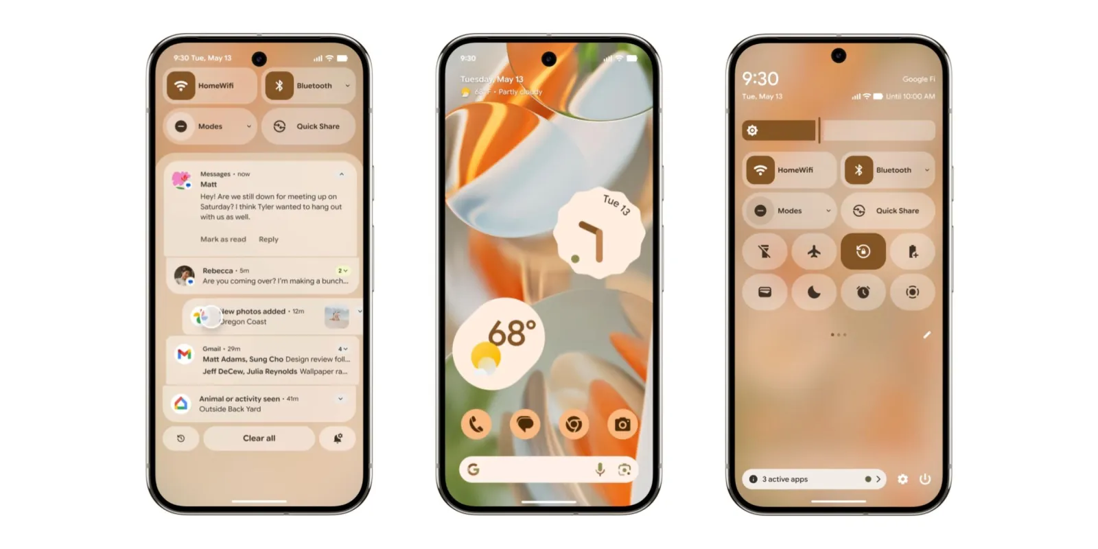
Google rearranged various components on the lockscreen to begin these adjustments (for Pixel). For instance, the day/date and At a Glance weather now show up to the right of the corner clock when you have notifications enabled. If not, it shows up right above the fingerprint circle, beneath the entire time.
Alerts from ridesharing, delivery, and navigation applications will be displayed on the lockscreen and always-on display (AOD) during live updates. It will show up as the first item in notifications when your phone is opened, and you can tap the Live Updates pill next to the time to display the entire message.
New icons in the status bar typically divide items into discrete components. The homescreen At a Glance is somewhat smaller.
You’ll see that blur when you pull down for the shade, making your wallpaper (in the example above) visible in the backdrop. Pill-shaped buttons for alert preferences, notification history, and clear all are located at the bottom.
With resizable tiles that let you fit more actions, that effect is seen when the Quick Settings panel is fully opened. When QS Tiles are enabled, they often change from pills to rounded rectangles. A larger brightness slider with a noticeable handle is located at the top, and the volume slider receives the same treatment.
Later this year, Android 16 will launch with this Material 3 Expressive overhaul, first on the Pixel. Material 3 Expressive will also start showing in Google apps, with the revamped Google Keep and new Gemini widgets conforming to this new design language.
Material 3, which was unveiled in 2021, is said to have evolved into Material 3 Expressive. It’s neither “M4” nor a new design system. Google claims that “by evoking a feeling or mood through visual design and interaction, expressive ui have an emotional impact, fostering connection.”
With new “shape options, emphasized text, and other expressive updates,” it begins with fifteen components that have been modified or added. Today’s new elements include toolbars, loading indicators, button groups, FAB menus, and split buttons.
In the meantime, Google has made updates to the following: Progress indicators, Carousel, Common buttons, Extended FAB, FABs, Icon buttons, Navigation bar, and Navigation rail.
Then there’s a new Motion-physics system that “feels more natural, fluid, and alive during interactions and transitions.”
Spatial springs make animations lucid and predictable by reflecting the physics of actual object motion. Smooth color and opacity shifts are produced by effects springs.
Material 3 Expressive highlights information hierarchy and crucial actions through typographic styles:
New type styles for variable and static fonts can be utilized to express a range of emotional moods, automatically modify variables for readability, and allow bold editorial layouts.
Google touts a new set of 35 shapes that may be utilized to create avatars, image croups, and other aesthetic embellishments.
Smooth transitions between shapes are made possible by an integrated shape-morph animation. This might be as basic as a square turning into a circle, or it can be dynamic.
A wider variety of colors is available to “sharpen hierarchy and clarify key actions.”
In order to “help guide the viewer’s attention to the most important elements of the screen,” Google provides developers some expressive approaches. This entails making use of motion, color, forms, typography, and containers.
We use cookies to ensure that we give you the best experience on our website. If you continue to use this site we will assume that you are happy with it.


