Google has started rolling out a fresh new look for its Docs app on Android devices, bringing what the company calls its Material 3 design language to the popular word processing app. The update represents one of the most significant visual changes the app has seen in years, moving away from the familiar interface that millions of users have become accustomed to.
The change is part of Google’s broader effort to modernize the appearance of its apps across Android phones and tablets. Material 3, which Google calls its most expressive design system yet, focuses on making apps feel more personal and colourful while keeping things simple and easy to use. The new design brings softer edges, updated colours, and a generally cleaner feel to the entire experience.
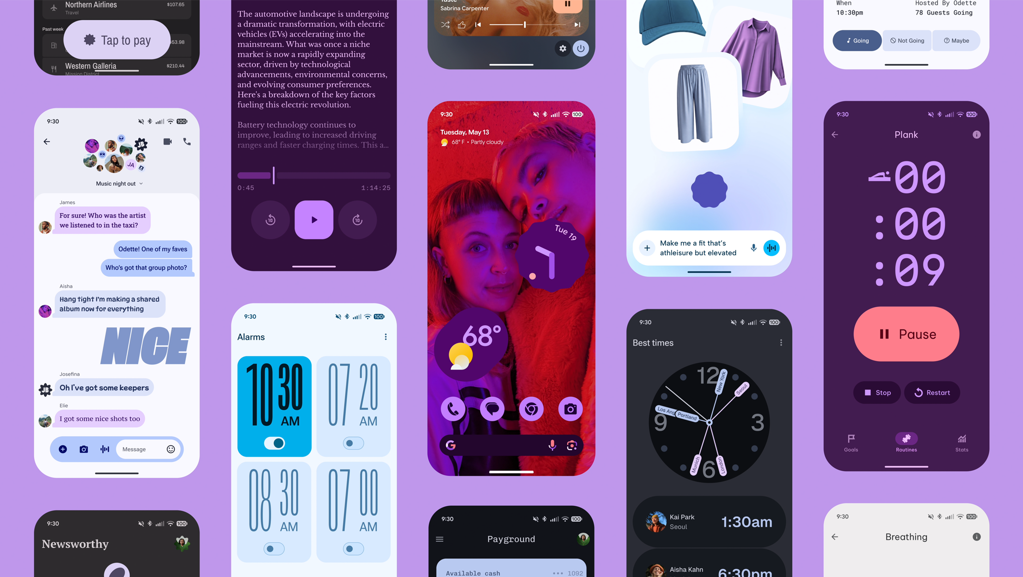
When you open the updated Google Docs app, the first thing you’ll notice is how different everything looks. The toolbar at the top has been redesigned with new icons that are easier to recognize at a glance. The colours throughout the app have been adjusted to create better contrast, making text and buttons stand out more clearly against the background. These changes might seem small individually, but together they create a noticeably different experience from what users saw before.
Google has also updated how documents appear in your file list. The preview thumbnails now have rounded corners instead of sharp edges, matching the overall softer aesthetic of Material 3. The spacing between items has been adjusted too, giving everything more room to breathe and making it easier to tap on the document you want without accidentally opening the wrong one.
The formatting toolbar, which appears when you’re editing a document, has received particular attention in this update. The buttons for making text bold, changing alignment, and adjusting spacing have been redesigned to be more intuitive. They’re larger than before, which makes them easier to tap on smaller phone screens, and they use clearer symbols that better communicate what each button does.
One of the more noticeable changes involves how the app handles colour. Material 3 allows the app to pull colours from your phone’s wallpaper and use them throughout the interface, creating a more cohesive look between your home screen and your apps. This means that the accent colours in Google Docs might match the colours in your background image, making the whole experience feel more unified and personal to your device.
The navigation menu, which you access by tapping the three horizontal lines in the corner, has been reorganized as well. Options are now grouped more logically, and the entire menu has a cleaner appearance that makes it easier to find what you’re looking for. Whether you’re trying to access shared documents, browse through templates, or adjust your settings, the new layout helps you get there with fewer taps.
For people who use Google Docs extensively on their phones, these changes go beyond just looking different. The improved touch targets make it easier to work on documents without constantly zooming in or worrying about tapping the wrong button. The better contrast helps reduce eye strain during long editing sessions, and the overall cleaner design means less visual clutter competing for your attention.
Google has been gradually bringing Material 3 to its various apps over the past year. Gmail, Google Calendar, and Google Drive have all received similar updates, and now Google Docs is joining that list. The company has said it wants to create a consistent experience across all its apps, so when you switch between different Google services on your phone, they all feel like they belong to the same family.
However, change isn’t always welcome, especially when it comes to tools people use every day for work or school. Some users have expressed frustration with the new design, saying they preferred the old layout and don’t understand why Google keeps changing things that were working fine. This reaction isn’t unusual whenever popular apps undergo major redesigns. People get comfortable with where buttons are located and how things work, and having to relearn those patterns can be annoying.
The update is rolling out gradually, which means not everyone will see the new design at the same time. Google typically releases updates in phases, starting with a small group of users and slowly expanding to everyone over several days or weeks. This approach helps them catch any problems before they affect millions of people. If you haven’t received the update yet, you should see it appear automatically in the coming days as long as you have automatic updates enabled for your apps.
For those who do receive the update and aren’t sure about the changes, there isn’t a way to switch back to the old design. Once Google rolls out a new interface, the previous version typically becomes unavailable. This is standard practice for most app updates across the industry, not just Google apps. The company’s reasoning is that maintaining multiple versions of the same interface would be complicated and would prevent them from moving forward with new features.
The Material 3 update affects only the Android version of Google Docs for now. The iPhone version uses Apple’s design guidelines instead, so it looks quite different from the Android version anyway. The web version of Google Docs, which you use in a browser on your computer, hasn’t received this update either, though Google will likely bring similar changes to the desktop experience eventually.
Beyond the visual changes, the update doesn’t add major new features to Google Docs. The core functionality remains the same, you can still create documents, edit them, share them with others, and access all the formatting tools you’re used to. The main difference is that all those existing features now have a different appearance and, in some cases, are organized slightly differently.
For businesses and schools that rely heavily on Google Docs, these design changes shouldn’t disrupt workflows significantly. The learning curve is relatively gentle since the changes are mostly visual rather than functional. Most people should be able to adapt to the new layout within a few minutes of using it. The bigger buttons and clearer organization might even make things easier for users who previously struggled with the app’s interface.
We use cookies to ensure that we give you the best experience on our website. If you continue to use this site we will assume that you are happy with it.


