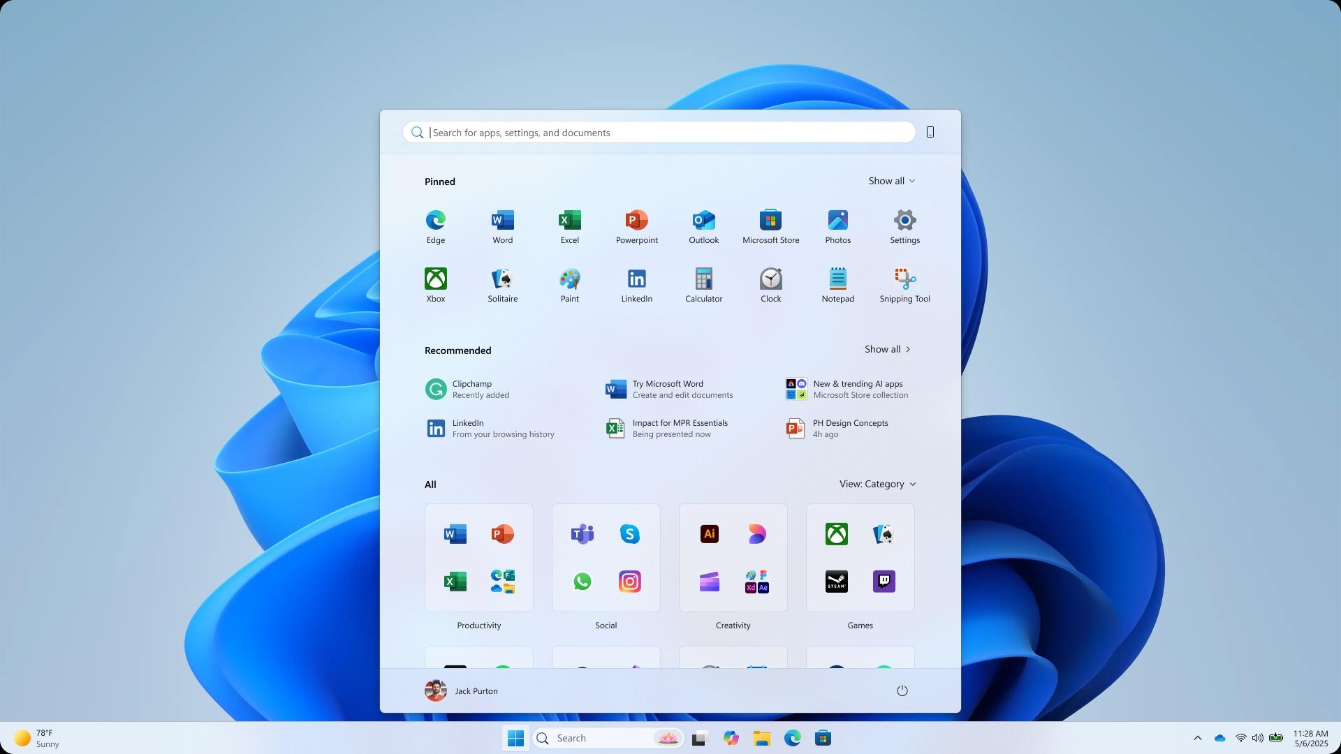
Later this year, Microsoft plans to update Windows 11 with a new Start menu. The primary Start menu page and the all-app list are combined in the new, customisable style.
This month, Microsoft says it is reworking the Start menu in Windows 11 with a broader layout that at last allows you to turn off the suggested feed of files and apps. Although the current Start menu in Windows 11 looks different from the new one, Microsoft has recently shown concept photos that show how this redesign may have looked.
The designs demonstrate the range of choices the organization has investigated, some of which are more intriguing than others. With the list of all apps at the left and Windows 11’s pinned and recent files at the right, one of the designs seems to try to merge the Start menus of Windows 10 and Windows 11.
Microsoft unveiled five prototype ideas that may have drastically changed the way the Start menu functions in Windows in a blog post that described the makeover process. One features a dedicated For You section that displays Teams meetings, YouTube videos, and recently used files, as well as an even more rounded menu with widget-like capability.
One concept separates the For You section at the side, while the main menu focuses on app categories. Another prototype envisions a landing page that functions as the Start menu, complete with files, apps, shortcuts, and distinct sections for accessing your Android phone, customized app lists, and creation tools. With its distinct sections that you seem to scroll vertically to access, the start menu concept even seems to occupy the full vertical space of a screen.
Another design appears to be a sort of replacement for the full-screen menu in Windows 8. That, the writer believes, not a lot of Windows 11 supporters would have been fans of. In this design, the display area is occupied by a “Start screen” and a blurred background. Above, you can see the apps you have pinned and a “create” section where you can use Microsoft services like PowerPoint, Designer, and Clipchamp.
The Windows design team claims that nothing was too frugal, including floor-to-ceiling paper mockups, Figma frames, and whiteboards. “Before using the editorial pen, the team drew a ton of layouts, letting our creativity run wild and finding new things.”
The design team writes, saying they counted scroll wheels, watched eye-tracking heat maps swirl, and listened for ‘oh!’s of delight to know where they were hitting the mark.” Microsoft tested its numerous Start menu designs with over 300 Windows 11 enthusiasts and even conducted co-creation calls with a select group of fans.
Easy app visibility, customization, speed, and avoiding a major overhaul to “respect three decades of muscle memory” have been the main goals of the new Start menu. The outcome is a larger and more adaptable Start menu than the one that is currently available. Being able to delete the recommended feed will be a pleasant improvement for many, and the phone companion panel seems like it’s fully embedded into the Start menu to allow rapid access to recent calls, texts, and phone files.
Many of the designs that are displayed feature either a “create” section or a “for you” section. The purpose of the “for you” area was to display recent files together with your forthcoming day, including any meetings or chores to finish. Both of these areas are absent from the Start menu that will soon begin releasing.
There is a section for your phone in another Start menu design. Although the Phone Link companion is now coming with the updated Start menu, one of the designs depicts it as part of the menu rather than only as a sidebar.
Microsoft has favoured a more straightforward Start menu, and all of these concepts were abandoned.
All Windows 11 users should anticipate seeing this new Start menu in the upcoming months as Microsoft tests it with Windows Insiders within the next month.
We use cookies to ensure that we give you the best experience on our website. If you continue to use this site we will assume that you are happy with it.


