For the next few months the general public will see Venmo implementing a major change that aims at improving the app’s usability, social media and network presence, and ease of use. This is the largest update to the peer-to-peer payment software since 2021, its inception.
Venmo launches its biggest app redesign in years to address long-standing privacy concerns, improve navigation, and address outdated UX issues. Its parent business, PayPal, is undergoing a significant corporate restructure at the same time as this structural and visual overhaul.
As a matter of fact, the timing is important with Venmo’s parent company, PayPal, which is reorganizing to separate Venmo as a separate company with a move that is generally regarded as setting the stage for a possible sale in the nearest future. Reports say that Stripe has indicated interest in purchasing PayPal outrightly. In that situation, a striking redesign appears more like a window-dressing job prior to a transaction than a regular update.
Most likely this week will mark the start of the rollout, and over the coming months, more features will be added. The complete revamp should be accessible to all users before the end of the year.
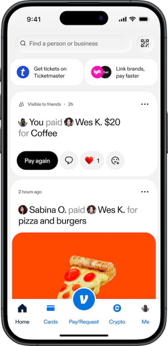
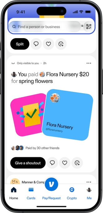
This week, the redesigned and updated feed will be among one of the first things its users will notice starting this week. The new feed will give its users a greater range of visuals and larger photos in addition to more methods to react to payments, such as reactions and quick action buttons like “Pay Again” and “Say Thanks.” Previously, it displayed a straightforward list of who paid whom, complete with GIFs, a heart button, and comments. In addition to this, it will be a more custom one for the user with a display of product recommendations based on past purchases and customized cashback offers from businesses its users shop at.
The opportunity for consumers to directly recommend their preferred local companies through the app is another enhancement. There will be a new feature, a “Give a Shoutout” button, in the feed that is directly below the payments button.
Alexis Sowa, Venmo’s general manager and senior vice president, told members of the press that one of the things that the team hears a lot, especially from the Gen Z generation and generations that are much younger who are also regarded as its audiences, is a real desire to support and endorse local businesses or merchants that they like. He went on to say that providing them the chance to share what they refer to as “social proofing” with this feed change. Its users will be able to sort of recommend that company in the future by giving it a thumbs up, as if to say, “I go to you.”
In the coming months, two more tabs, “Send” and “Money,” will also be revealed. And rather than having to search through previous contacts or user names, users’ most frequent connections now show up in the Send feed as a row of profile icons with additional information. The bill-splitting “Groups” option, which allows users to split bills with up to 30 others, is now more easily accessible. In the Send area, users may also plan payments and send gifts to pals.
On the other hand, users have the privilege to monitor their spending and access Teen Accounts and Crypto under the Money tab.
In addition to all, the all-time limited deals will be gathered in a new rewards tab. The Stash program from Venmo will also be housed here. This was introduced in November of last year and offers users up to 5% cash back when they use the app to shop for their preferred brands. The money is then transferred straight to their Venmo Mastercard debit card for the purpose of self.
According to the vice president, Sowa proclaimed that a year of user research led to the redesign, and also one of the most important discoveries was how many features people were unaware of. She also remarked that the number of features and functionalities that exist that [customers] simply don’t know exist in the app is one of the biggest insights.
The redesign is in line with a larger trend of younger user demand and preference for payment apps, which are more social platforms and less utility tools. For example, the European financial app Revolut offers features like group bill splitting and in-app messaging, while applications like Verse and Daylight allow users to monitor their friends’ spending habits and limits.
Before a prospective new owner shows up, Venmo is obviously making an effort to satisfy its core user base’s growing desire to view and share financial activity in the same manner as they would on any other platform’s feed.
The corporate spin-off and acquisition rumours have made Venmo’s redesign a critically timed one, as PayPal has structured Venmo into an independent business unit to clean up its financial reporting, which had reportedly been drawing interest from major fintech players like Stripe, turning the makeover into tactical “window dressing” for potential buyers.
Meanwhile, aggressive monetization goals add further urgency, with Venmo under immense pressure to convert its customer base of about 90 million active users into direct revenue through features like the Venmo debit card, business profiles, and rewards partnerships, aiming to hit $2 billion in annual revenue by 2027.
We use cookies to ensure that we give you the best experience on our website. If you continue to use this site we will assume that you are happy with it.


